Order size & data size don’t match up
Data Submission Guideline
The Data Creation Guide
We have prepared guides that cover the ins and outs of preparing artwork for print. Like you, we want your data to print perfectly, every time. These simple guides are to help you avoid the risks of designing for print and ensure your design rolls off the press just as you intended.
Whether you’re a beginner or an experienced designer, please read through our guides. If you follow these guidelines and supply us with properly prepared data, you can relax knowing that your design will print perfectly, every time.
Printing Basics
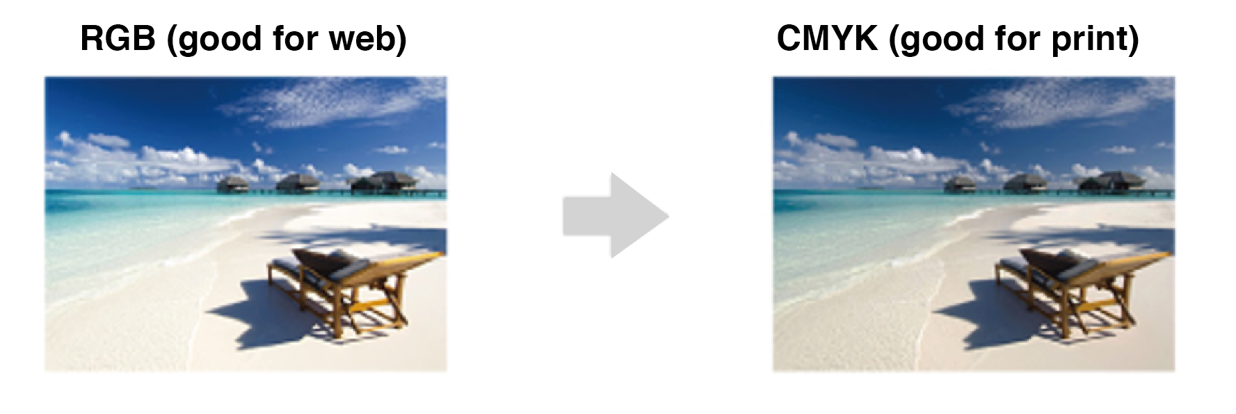
- The difference between RGB and CMYK
- Specifying orientation on your print data
- Ink rubbing / ink transfer
- About halftones
- Regarding the trimming process
- Print Sizes
- Recommended software
Frequently Overlooked Mistakes
Here at Metro Print, we check all submitted data to confirm whether it is ready for print or not. If this is your
first-time ordering or if you’re unfamiliar with the methods to prepare print data, then this guide is for you.
Below are some mistakes to avoid when placing your order online. To ensure your prints come out nicely, be sure to read through the end and verify that your artwork meets our print requirements.
Note: Metro Print will not be responsible for data that fails to print properly due to poorly prepared data.
Order details & data specs don’t match up
If the print colours don’t match between the order details and the data specs, your order will be put on hold until we can confirm this with you.
For ex: If you place an order for one side colour flyers (4c/0c) but you upload a file that has two pages (4c/4c).
Relevant to:
Illustrator
Photoshop
Indesign
One side colour (4c/0c)
Both sides colour (4c/4c)
If your data size does not match the order size, your order will be put on hold until we can confirm this with you.
For example: If your order is for A5 size flyers, but the data is A4 size.
Relevant to:
Illustrator
Photoshop
Indesign
Order size: A5
Data size: A4
Have you converted all text to outlines?
If your text has not been converted to outlines, there is a good chance we won’t have the specific fonts you used in your data. So, we will not be able to print your data.
Relevant to:
Illustrator
Are your images properly embedded?
Have you made sure your images are embedded and not just linked? If your images are linked or missing, we won’t be able to proceed with your order.
Relevant to:
Illustrator
Linked file.
Embedded file.
Missing linked file.
Additional finishings?
If your order requires any special finishings please make sure to include the necessary marks onto the data.
Without the proper marks or indicators on the artwork we will not process your data.
If the print colours don’t match between the order details and the data specs, your order will be put on hold until we can confirm this with you.
For ex: If you place an order for one side colour flyers (4c/0c) but you upload a file that has two pages (4c/4c).
Relevant to:
Illustrator
Photoshop
Indesign
The 9 Point Data Checklist
Setting up data for print can be a complex process, especially if this is your first time. We want to ensure your print jobs come out the way you want them to. Before you upload your artwork, verify your data against our checklist to make sure there are no issues when it comes to printing your job. Please feel free to consult with us before commencing big jobs as it may save you valuable time and money.
Irregular Data Size
If the data you upload is a size that fits within your order size, and there are no problems with the data, we will presume you are wanting this irregular size. We will not expand nor will we shrink your data to fit the larger size.
For example: You order A5 (21 x 14.8cm) size flyers, but the data is 20 x 10cm.
Order size: A5 (21.0 x 14.8cm)
Data size: 20 x 10cm
Colour Settings and Colour Mode
If your data has been created in RGB colour mode, when it is force converted to CMYK colour mode, there will be a noticeable shift in colours, and a few shades darker. This is an expected result when converting from RGB to CMYK.
When designing for print you should always start in CMYK colour mode. To set your CMYK color settings to CMYK you can do the following:
Edit > Color Settings >
In the following window, look for ‘Working Spaces’ and select ‘Japan Color 2001 Coated’ from the drop down list. Press OK.
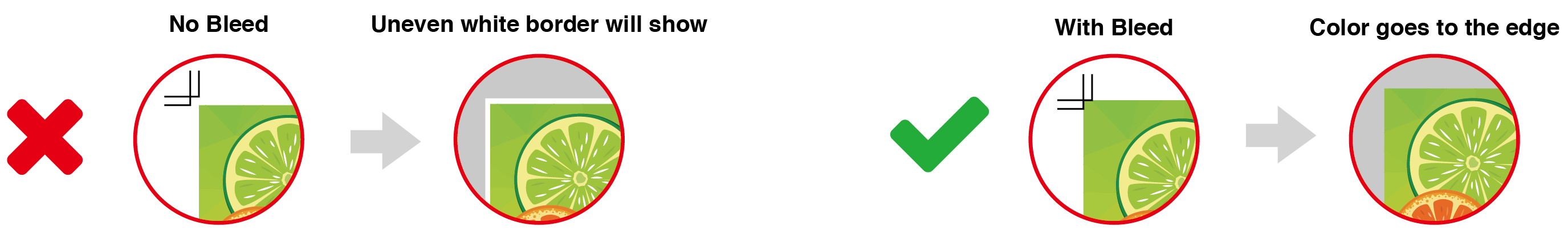
Bleed
All print data must have a 3mm area that extends beyond the cut line to allow for discrepancies during the final trimming process. This is known as the bleed.
Text is not within the Safety Area
Avoid placing logos and text outside of the safety zone. Objects that are not in the safety zone may be cut off and lead to undesired results.
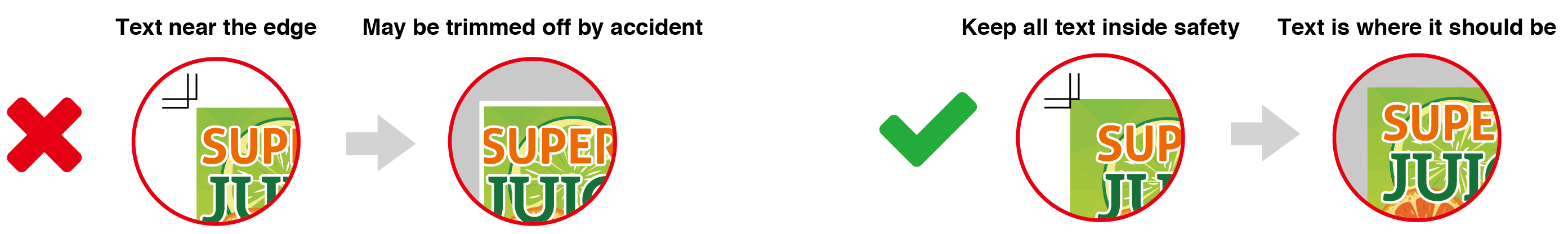
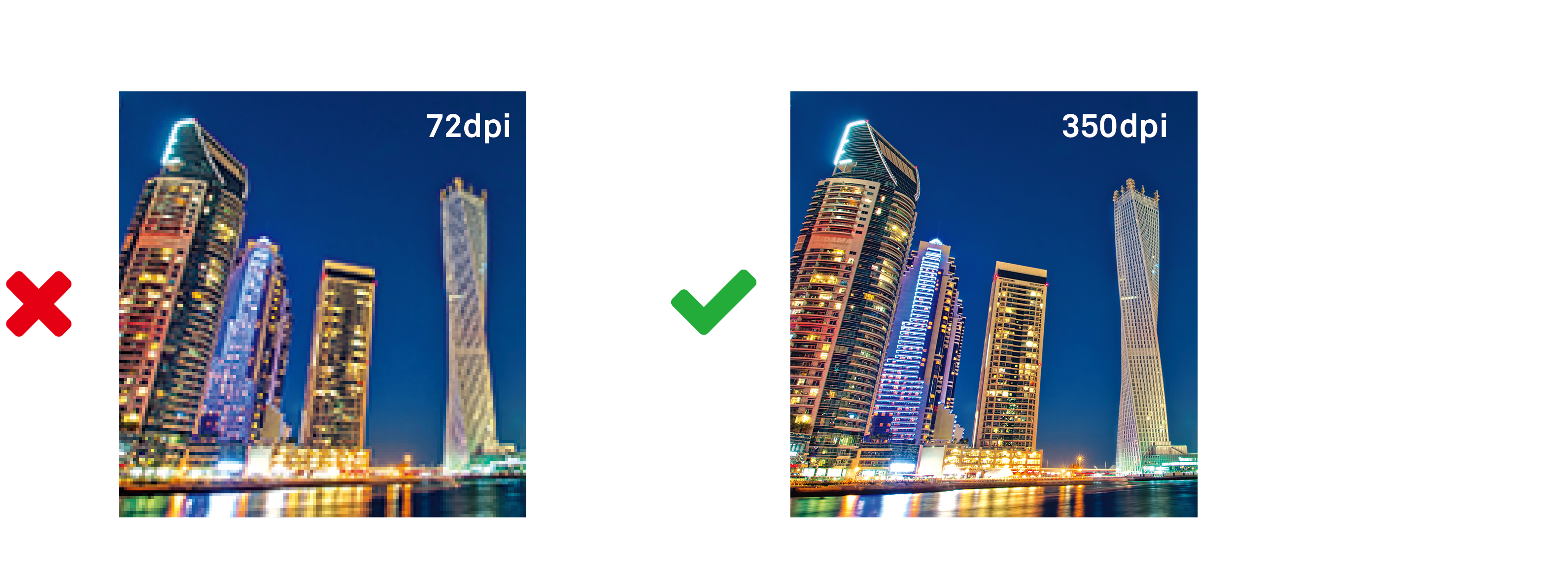
Image Resolution
Low quality images make your finished print product appear unprofessional. To avoid quality loss, any images for print always need to have a minimum resolution of 300 dpi at the original (image) size. Photos that are downloaded from the internet generally are low quality at 72 dpi resolution.
Logos, text blocks and graphics that are integrated into the document must be embedded as a vector or as an image with at least 300 dpi, because they will otherwise appear grainy or unfocused.
See-through black phenomenon
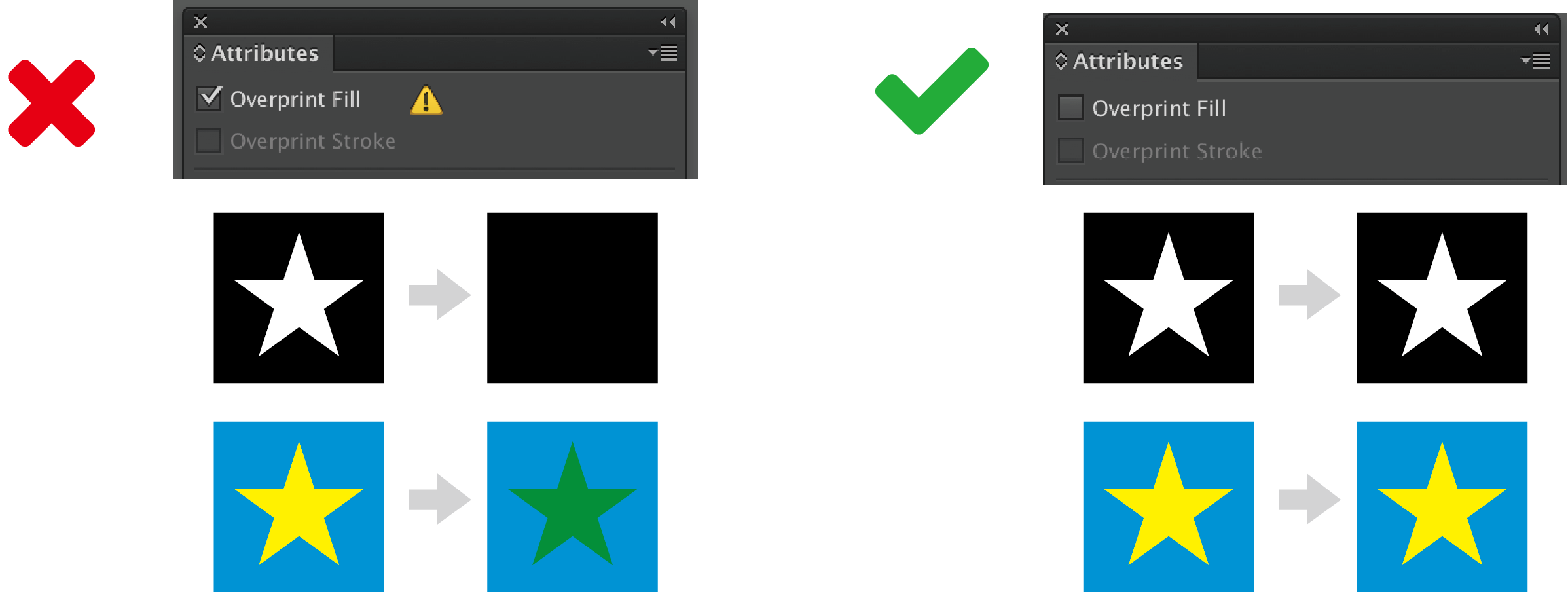
Objects set to 100% black will overprint by default. Overprinting is when a colour prints over another colour, showing through the colour underneath, otherwise known as the transparent black phenomenon.
To prevent this from happening we suggest doing one of the following:
- Change the values to 99% black (K)
- Add 1% of CMY ink to the 100% black (K)
- Use rich blacks instead of pure blacks.

To overprint or not to overprint, that is the question
Data of K100% of overprint, the object color or disappears change , such as output the results of printing may be different from the customer's image.
Untick the check next to ‘Overprint Fill’ so that your objects don’t disappear.
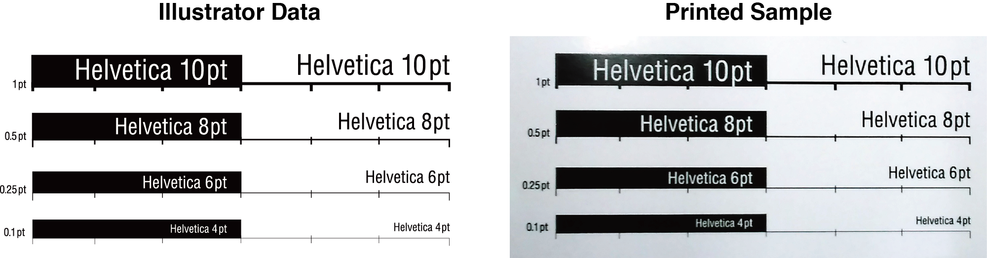
Font and Line Weights
Small characters, thin lines and hairlines will not print out properly. In the data small text or fine hairlines might look okay but in print lots of detail is lost when producing tiny elements. They become illegible.
If you want to use thin lines dont go bellow 0.25pt., only if your lines are a solid colour. For mixed colours we recommend at least 0.4pt thickness.
Rule of thumb for small text is no smaller than 6pt. Keep this in mind when setting any small print within your designs.
Spanning text across a spread
If there is text spanning across any folds, you should keep in mind how the fold will affect the text. When paper folds, sometimes it creates small tears on the edge of the paper. Small text can become difficult to read across said tears. When designing for booklets, spanning text across two pages might lead to mis-aligned text once the item has been bound.
The best way to avoid these kinds of problems is to keep text from spanning across any folds or spines.
When text runs across the fold, the creasing in the fold can cause ink loss and make the text not look clean.
Half Fold
With staple / glue binding, the horizontal alignment is not perfect and therefore lines of text running across a spread will be affected and is therefore best avoided.
Folding deviation
Due to the nature of all post-press finishings (Folding, Crease + Folding, Staple-binding, Perfect binding, etc..),a slight fold or binding mis-alignment is within the acceptable +/- margins of error.
Designs where there is a bright contrast in colour may cause the small discrepancies to become more noticeable.


 info@metroprint.ph
 0945 826 3908
 0945 826 3908